


3 TRADITIONAL LINE ART ILLUSTRATIONS:
These were the line art illustrations that Rusty told me to redo and we had to redo three on illustration board, so I feel like they are the most decent ones to pick out of the batch. I like the simpleness of my profile in the first one. I like the lines on the tree in the second one. I like how I added in the bricks (not all of them, just several) for the apartment building. I feel like line art is so boring without color. It was so hard to create shadows with just a black sharpie.


2 WATERCOLOR ILLUSTRATIONS:
Even though it was a 20 x 30 illustration, I did not think painting went that horribly. It did take like five hours, but it was great working on it on a Sunday morning not feeling rushed. I really wanted to capture all the pretty colors of the sunset, but I added my own mix of colors. I knew that I wanted to use a lot of different colors. For the pretzel, it took forever on this small thing! It took forever to mix the correct shade of brown/orange shade for the pretzel. I actually freehanded sketched out the outline of this one, instead of tracing it, which took so long, because it always ended up looking wrong or fat. And then I had to add all the highlights and then I had to add the salt. But in the end, I think it turned out alright, I mean it looks like a pretzel and makes me want to eat one really bad.
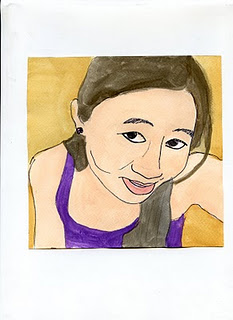


3 TRADITIONAL LINE AND COLOR ILLUSTRATIONS:
So this self-portrait, I think is the best one out of the five I had to do. I like the composition and the angle, and I think it looks most like me. I love my hummingbird! I love the colors of the feathers. I think it turned out pretty well, but it could be a little less flat and more three-dimensional. I also like my elephant, but I had trouble with filling in the grass. I really like his ears!
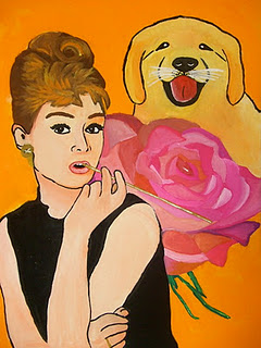
1 GOUACHE ILLUSTRATION:
Three of my favorite things: Audrey Hepburn, a rose and a golden retriever puppy. I wish it was less flat, but I didn't want to mess with it anymore. I added more definition to her her arms, neck, and face. I added highlights to her lips. The rose was hard to work out, with all the different shades and layers, it got very frustrating. The puppy still looks flat. but I added some brush strokes to make it look more like fur.

1 DIGITAL LINE ART ILLUSTRATION:
I just really like this tree illustration. I like the texture and style of the fence and dirt. It looks like something that can be in a Winnie the Pooh book. It seems very peaceful and is a simple line drawing.

1 DIGITAL AND COLOR ILLUSTRATION:
I really like this thumbtack illustration. I like how it looks like its stuck through the paper it was on when it was printed out. It could be better, but it was one of my first attempts at digital line art.

1 MY CHOICE:
I decided to choose my peacock watercolor illustration. I really like the colors of it. The feathers are very interesting to look at and I really like the composition. I wish that it was more three-dimentional and had more definition to the peacock. I really like the bright green feathers in the back. I think this was a good first attempt at a very large watercolor illustration.


